
19th January 2018
Last year Graham and Brown revealed their Colour of the Year for 2018, and it’s good news for lovers of pink. “Penelope” is a dusky pale shade that can be used to create a warm inviting atmosphere anywhere in your home.
Passion For Pink
The announcement may have come as a welcome antidote for some, to the brighter bubble-gum pink shades which have been so prevalent throughout the previous twelve months. These pop-art pinks have been teamed with neutral greyed pinks to great effect, balancing out the sugary-sweetness; the visual equivalent of sweet and salty popcorn. For those who wanted to avoid a pink overload, pairing this “millennial pink” with cool tones from the opposite side of the colour wheel, for example teal, also resulted in a striking aesthetic.

https://www.instagram.com/grahamandbrown/
Although it’s clear that we’ve all seen a lot of pink lately, this colour trend looks set to stick around. It seems that a move away from bright bold colours is happening as muted, delicate tones come into vogue, and Graham and Brown’s selected colour for this year is bringing a grown up, sophisticated pink to your palette.
Purple Patch
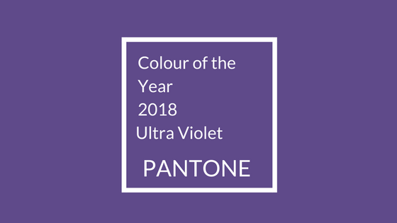
Penelope pink from Graham and Brown pairs very well with the Pantone Colour of the Year 2018, Ultra Violet. Said Leatrice Eiseman, Pantone Colour Institute’s Executive Director “…with the purple family, you have the wonderful opportunity to incorporate your pinks with purples, which is absolutely spectacular together. Incorporate some of the Ultra Violet just to keep it updated, to refresh it, to give it a slightly different slant.” Together, these two colours really capture the current style.
Botanical & Mythological Inspiration
Graham and Brown have also selected a Wallpaper of the Year; Pierre. This perfectly complements Penelope, featuring pink-tinged creamy magnolia flowers on a metallic, white-gold background, one of five colour schemes for the wallpaper. As Paula Taylor, Graham & Brown’s colour trend specialist says; “The botanical, return to nature trend continues to be big for 2018, but this paper is a glamorous take on florals and shows bold, maximalism can also be refined.”
The print takes inspiration from the present botanical trend, and is named for Pierre Magnol, the famous French botanist who was responsible for the invention of the concept of plant families and whose name was also given to the large genus of ornamental flowering trees, Magnolia. Pair the print together with Penelope for a beautiful romantic effect; “’This comforting, blush colour palette works to create a warm spring feeling in your home. Chic and neutral, it can standalone or work perfectly when combined with the flowering pink magnolias seen in the Pierre wallpaper.’

https://www.instagram.com/grahamandbrown/
The magnolia is a symbol of dignity and purity, which also ties in very well with G&B’s Colour of the Year. The character Penelope in Greek mythology symbolises patience and faithfulness; in the story of the Iliad, she waited for decades for her husband Odysseus’s return home, and refused to consider any other suitor despite being endlessly bestowed with offers from interested parties.
Graham & Brown’s selection of Penelope for the 2018 Colour of the Year falls in line with Dulux, who only a week before this announcement had chosen Heartwood, described as “a warm neutral, with a hint of heather”, and a palette of complementary colours; Pink Parchment; Blossom Tree; Woven Willow; Fallen Burr; Rose Park; Blackberry Bush; Wooded Solace; Sapphire Salute; Pine Cone; and finally Heartwood itself, all corroborating the trend for warm, pink, natural and botanical themes displayed in the choices from Graham and Brown.

The new year may have brought an array of recommended colours to vie for our attention, however trends should never overrule our personal taste. As Eiseman says: “it does not mean that at the end of the year the colour falls off the end of the earth and is never to be seen again!” Check out our post about the 2017 Pantone Colour of the Year ‘Greenery’ and bring that fresh shade with you into 2018.
19th January 2018